Your definitive guide to logo types
It can be a daunting prospect to decide what kind of logo best fits your business. We are here to help with our guide to the different kinds of logos and their pros and cons. Get ready to take those first steps towards your exciting new logo!

Wordmark / logotype
A wordmark logo consists solely of text, typically using the brand or company name. The focus is on the aesthetic appeal, legibility, and typography choices to convey the brand's identity.
Pros:
Simplicity and Clarity: Wordmark logos rely on typography to convey the brand name, making them straightforward and easy to understand. They often have a clean and minimalist aesthetic, which can be good for brand recognition and legibility.
Versatility and Adaptability: Wordmarks can adapt to different colour schemes, backgrounds, and visual contexts while maintaining brand consistency.
Cons:
Lack of Symbolic Representation: They may lack the ability to incorporate symbolic or illustrative elements. This can limit the logo's ability to communicate the brand's ethos, values, or industry.
Potential for Similarity: Since wordmark logos sometimes use commercially available fonts there is a higher chance of similarity with other brands that use similar or identical typefaces. This can be somewhat negated by customising the lettering, or designing bespoke letters for the logo.
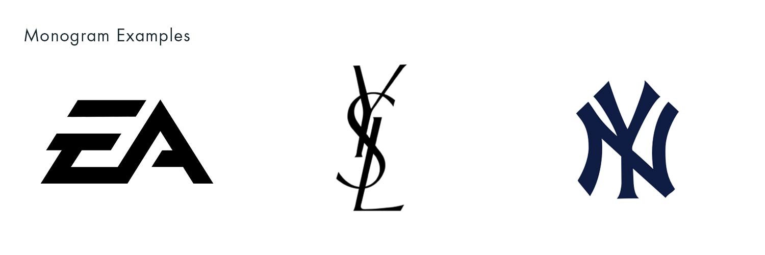
Monogram / Letterform
A monogram logo consists of one or more initials or letters combined in a unique way. They are often used by an individual, or organisation wanting to turn their initials into a striking and cohesive design.
Pros:
Simplicity and Memorability: Monogram logos are often easy to recognise. By condensing the brand name into a combination of initials or letters, they can create a strong and memorable visual identity.
Versatility and Adaptability: Like Wordmarks, Monogram logos are typically versatile and can be easily applied to different mediums, and incorporated into various brand materials and colour-ways.
Cons:
Limited Information: If used in isolation, Monogram logos can be lacking descriptive or informational elements that help tell your brand story. Without explicitly spelling out the brand name, there may be a lack of immediate recognition or understanding for new or unfamiliar audiences.
Potential Similarity: Due to the limited combination of initials or letters, there is a possibility of similarity or overlap with other existing monogram logos. It's important to ensure that the monogram design is unique and distinct to avoid confusion or association with other brands.
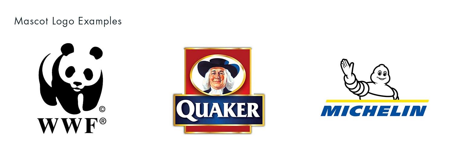
Mascot
A mascot logo is a type of logo design that incorporates a character or figure to represent the brand or organisation. The mascot is often a fictional character or an anthropomorphic representation of a real-life object, animal, or person.
Pros:
Memorable and Unique: Mascot logos have the potential to stand out and be easily remembered by customers. They can help create a distinct brand identity and differentiate your business from competitors.
Emotional Connection: Mascots can evoke emotions and create a connection with your target audience. They can be friendly, approachable, and relatable, which can help in building trust and loyalty.
Storytelling: Mascots often have a narrative or backstory associated with them. They can be used to tell a story about your brand, its values, and its mission, helping to engage customers on a deeper level.
Cons:
Limited Appeal: While mascots can be appealing to certain demographics, they may not resonate with everyone. The perception of a mascot can vary among individuals, and some people may not connect with the chosen character.
Potential for Over-complication: Mascot logos can sometimes become too intricate or detailed, leading to visual clutter and decreased legibility.
Longevity and Trendiness: Trends in design change over time, and what may be popular today might become outdated or less relevant in the future. Mascot logos can sometimes be associated with specific eras or fads, potentially requiring rebranding efforts to stay current.
Higher Cost and Time Investment: Developing a mascot logo can be a more time-consuming and expensive process compared to other logo styles. It often involves creating a unique character story and design.

Abstract
An abstract logo uses non-representational shapes, forms, lines, or patterns to create a unique and visually intriguing symbol. It does not directly depict any specific object or concept, but instead focuses on conveying a sense of creativity, imagination, and open interpretation.
Pros:
Unique and Memorable: Abstract logos have the potential to stand out and be highly memorable. Their distinctive and visually intriguing nature can make a lasting impression on viewers, helping the brand to be easily recognised and remembered.
Versatility and Timelessness: Abstract logos often have a timeless quality that can adapt to different design trends and withstand the test of time. They can be versatile in terms of colour, scale, and application, allowing for consistent branding across various mediums.
Cons:
Interpretation and Understanding: Abstract logos can be open to interpretation, which may result in varied perceptions or confusion among the audience. It may take more time for viewers to understand the intended message or association of the logo.
Brand Association: Without a direct representation of the brand name or specific object, abstract logos may not immediately convey the nature of the business or its industry.

Brandmark / pictorial mark
A brand mark consists of a unique and distinctive symbol or icon that represents the company. Unlike wordmark logos that primarily rely on typography, brandmarks are standalone graphical elements that can be instantly recognisable and associated with the brand without the need for accompanying text. Brand marks are often used by established brands with strong recognition or by companies that want to create a visual mark that can be easily identified and associated with their brand identity.
Pros:
Distinctive and Memorable: Brandmarks have the potential to be highly distinctive and memorable. They rely on unique symbols or icons that can create a strong visual impact and instant recognition, potentially making the brand stand out among competitors.
Versatility and Scalability: Brandmarks are often highly versatile and scalable. They can be easily applied to various mediums, sizes, and formats, including digital platforms, print materials, and promotional items.
Cons:
Lack of Immediate Brand Identification: Brandmark logos typically do not incorporate the brand name or any textual elements, which can make it challenging for new or unfamiliar audiences to immediately identify or associate the logo with the brand.
Evoking Desired Brand Message: Without the support of typography or text, brandmark logos rely solely on visual representation and symbolism. It can be more challenging to convey specific messages, industry associations, or brand values through a standalone visual element.

Emblem
An emblem logo combines typography and imagery within a unified, enclosed shape or frame. This style of logo design is often associated with a sense of tradition, prestige, or historical significance. Emblem logos are commonly used by organisations, institutions, and brands that want to convey a classic or vintage aesthetic.
Pros:
Classic and Prestigious: Emblem logos often exude a sense of tradition, heritage, or prestige. They can give a brand a timeless and established look, making it suitable for organisations or brands with a rich history or desire to convey a sense of authority.
Visual Appeal and Detail: Emblem logos often feature intricate details and visually appealing designs. The combination of typography and imagery within a unified shape or frame can create an aesthetically pleasing design that captures attention.
Cons:
Legibility and Scalability: Due to the often-intricate design and the combination of typography and imagery, emblem logos can sometimes face challenges with legibility, particularly when scaled down to smaller sizes. The fine details may become less clear, impacting readability.
Limited Adaptability: The enclosed nature of emblem logos can limit their adaptability across different applications and mediums. They may not work as well in certain digital formats or when applied to certain surfaces.
Combination
A combination logo is a type of logo design that incorporates both text and a symbol or icon.
Pros:
Brand Recognition: Combination logos provide both a symbol or icon and the brand name or initials, allowing for better brand recognition. This can help customers easily associate the logo with the brand and create a stronger brand identity.
Big Versatility: Combination logos offer versatility in terms of application. The symbol and text can be used together or separately, depending on the context and space available. This flexibility makes combination logos suitable for various mediums, including digital platforms, print materials, and merchandise.
Cons:
Complex Design: The combination of both text and a symbol can result in a more complex logo design. The challenge is to strike a balance between the visual elements and ensure a cohesive and harmonious composition that remains visually appealing and memorable.
Potential for inconsistency: Both the symbol and text need to have strict guidelines in place, so that they are used together consistently in size and position. We think a brand guidelines document is always a must have, but never more so than in this case.

Dynamic
A dynamic logo, also known as an adaptive or responsive logo, can change or adapt its appearance based on various factors or contexts. Dynamic logos often involve elements that can be rearranged, resized, or animated to provide a more tailored and engaging user experience. They are commonly used in digital environments, where the logo can respond and adapt to different user interactions or screen orientations.
Pros:
Adaptability: Dynamic logos can adapt to different platforms, screen sizes, or interactions. They can be resized, rearranged, or animated to maintain brand consistency and engagement across various environments.
Modern and Interactive: Dynamic logos have a modern and interactive feel, which can enhance user engagement and create a memorable brand experience. The ability to respond to user interactions or change based on context can make the logo more captivating and dynamic.
Cons:
Complexity: Designing and implementing a dynamic logo can be more complex and time-consuming than creating a static logo. It requires additional considerations and technical expertise to ensure smooth transitions, responsive design, and compatibility with different devices and platforms.
Brand Consistency: While dynamic logos offer adaptability, there is a risk of diluting brand consistency if not executed carefully. It's important to strike a balance between adaptability and maintaining key brand elements to ensure the logo remains recognisable and aligned with the overall brand identity.
Conclusion
As you can see there are many routes that a logo design project can go down and many logos fall into more than one category. It’s important to consider the pros and cons of the route you want to go down in relation to your own businesses needs and your audience. With enough consideration before the design process begins can you nail that concept and have that logo of your dreams!
Unsure what kind of logo best fits your business? Get in touch and we’ll help you discover the best route for you!